Visualizing Insights from My Spotify Data Lakehouse
After building a fully automated data lakehouse on Azure to ingest, transform, and enrich my entire Spotify listening history, including new data continuously pulled via the API, I wanted to take a deeper dive into the actual insights buried within that pile of data. While my initial exploration started with a few ad-hoc charts in a Jupyter Notebook just to understand the raw schema, this post represents the fully realized follow up. Everything you see here is driven directly by the curated Gold layer of my data pipeline, where rows have been rigorously cleaned, structured, and aggregated for analysis.
The goal of this exploration is to go beyond basic play counts and truly uncover the hidden patterns, long-term trends, and underlying psychological quirks of my personal music taste. To bring these numbers to life, I wanted the visual output to feel like a natural extension of the platform itself. By designing each chart with a sleek dark background and vibrant, Spotify-inspired green accents, the resulting visualizations maintain a cohesive, platform native aesthetic that perfectly frames the data.
Listening Volume Over Time
Chart 1: Monthly Listening Timeline
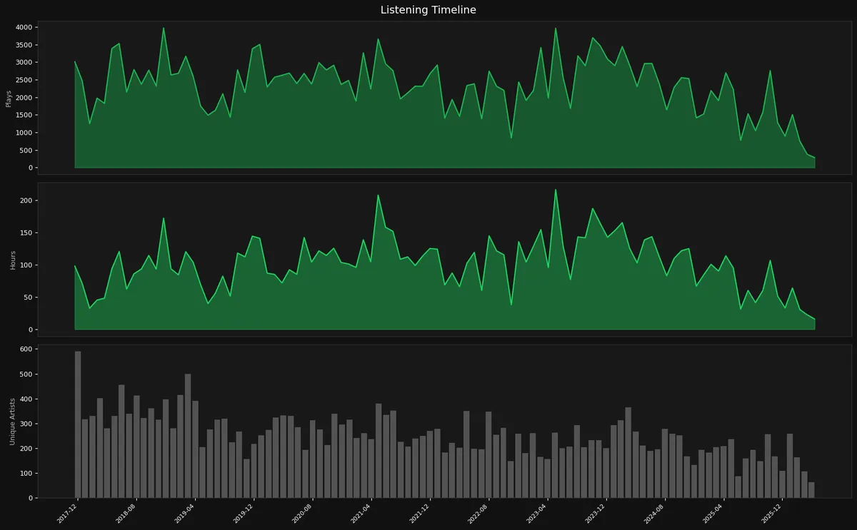
Three stacked time series showing how my listening evolved month by month where the top panel tracks raw play count, the middle tracks total hours listened, and the bottom tracks unique artists heard each month as a bar chart. This timeline really shows how intense my relationship with music has been over the past years, as the top 2 charts (total plays and hours listened) make it obvious I’m a very heavy listener. During peak periods like early 2019, mid-2021, and mid-2023, I was hitting close to 200 hours a month, which works out to about six or seven hours a day. Music is basically always on in the background, whether I’m working, commuting, or working out. The “Plays” and “Hours” charts also line up almost perfectly, which means my average track length hasn’t really changed over time.
The most interesting shift shows up in the unique artists chart. In the first half of the timeline I was exploring a lot more new artists, but over time that number has steadily dropped. Even when I’m listening more than ever, I usually stick to around 200–300 artists.
So while I still listen a lot, I’ve clearly moved from constant discovery to mostly replaying artists I already know and like.
Chart 2: Daily Play Calendar Heatmap
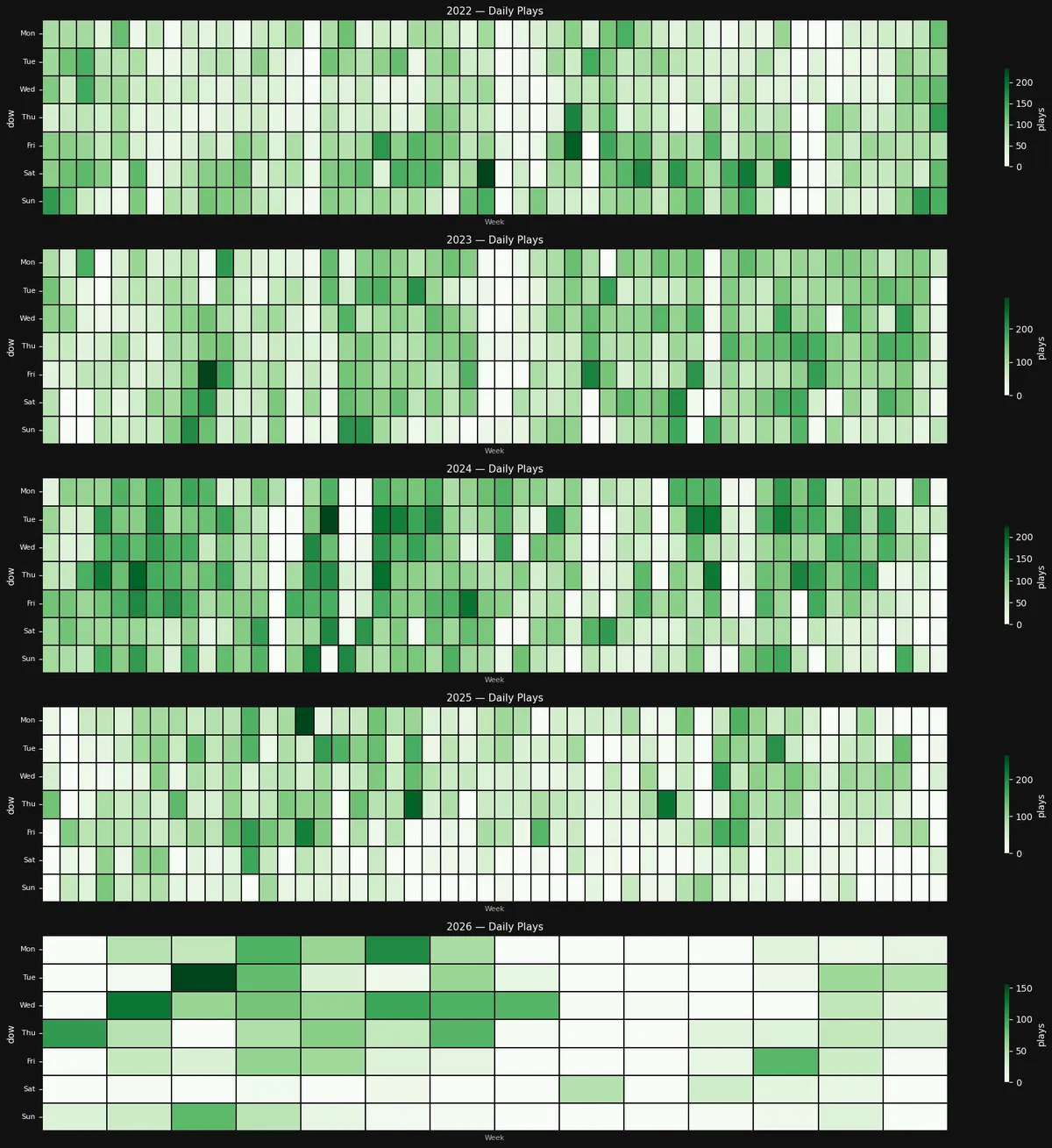
When I first pulled up this GitHub style heatmap of my daily Spotify plays, I was completely mesmerized by how perfectly it maps out the last few years of my life. Viewing my listening habits laid out day by day from 2022 to early 2026 reveals so much more than just my favorite songs. It is essentially a visual diary written in shades of green, where the darkest squares highlight the specific days I completely lost myself in music.
Looking closely at the grids, 2024 instantly jumps out as my absolute peak listening era where the sheer concentration of deep green blocks across that entire year, particularly on working days, is undeniable. This clearly points to a year when I had my headphones glued to my ears almost constantly. Then comes the striking visual shift in 2025. The heavy, dark clusters fade into much lighter, scattered shades, and my weekends in the second half of the year turn almost completely white. It is obvious that my routine changed dramatically here with a major lifestyle shift.
So far, 2026 is simply a continuation of the trend that started in 2025 and seems to be getting even whiter. We will see how things evolve for the rest of the year.
Chart 3: Time Patterns Triptych
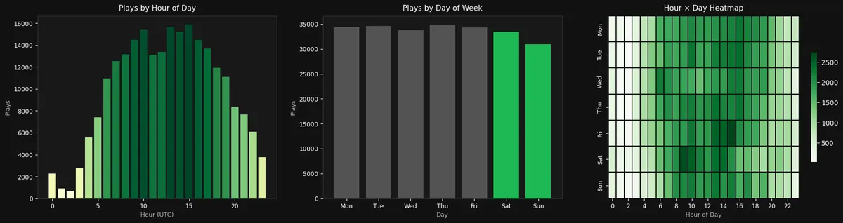
Looking at the breakdown of my listening by the hour (left panel: Plays by Hour of Day), my daily rhythm becomes incredibly obvious. The bar chart acts almost like an alarm clock, with listening practically non existent in the middle of the night before ramping up sharply early in the morning. The volume (no pun intended) stays consistently massive throughout the entire day, hitting its absolute highest peaks right around midday and mid-afternoon before slowly winding down as I head toward bedtime.
When breaking things down by the day of the week (middle panel: Plays by Day of Week), I was honestly surprised by just how rigid and consistent my habits are from Monday through Friday. The flat, uniform grey bars show that my weekday listening is practically identical day in and day out, showing that music is omnipresent in my daily life. The slight dip over the weekend makes perfect sense: those green bars show that when I step away from my desk, I am definitely spending a bit less time glued to my headphones.
The real magic happens when combining both of these metrics into the hour-by-day heatmap (right panel). That solid, dark green rectangle stretching across Monday to Friday is the ultimate visualization of my workday soundtrack, perfectly framing standard working hours. Interestingly, my weekend patterns look completely different as my Saturday listening concentrates heavily into a late morning burst, while Sunday is much lighter and spread out, perfectly capturing the vibe of a lazy weekend.
Chart 4: Polar Listening Clock
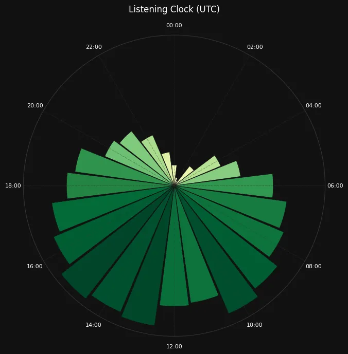
Wrapping my daily listening habits into this 24 hours circular clock format provides a really beautiful, holistic view of my routine. Instead of looking at my day as a linear timeline, this radial chart visualizes my listening history as a continuous loop, making it instantly clear exactly how much of my daily orbit is soundtracked by Spotify. The most glaring feature of this dial is the massive void stretching across the top. That quiet zone between 22:00 and 04:00 perfectly maps out my sleep schedule, showing an almost complete blackout of music. Those tiny, pale slivers creeping in around the late night and early morning hours are outliers of an occasional bout of insomnia or a rare all nighter. Meanwhile, the bottom hemisphere is completely weighed down by heavy, dark green wedges. My listening steadily builds throughout the morning and hits its absolute maximum depth right around 14:00 to 16:00 as seen in previous charts. It acts almost like an anchor at the bottom of the clock.
Top Artists and Tracks
Chart 5: Top 20 Artists by Plays & Hours
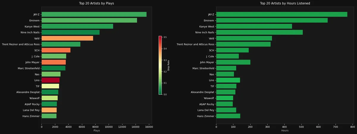
Looking at my top 20 artists of all time, my music taste is split between big hip-hop artists and movie composers. Big names like JAY-Z, Eminem, and Kanye West are at the top of my list in both total plays and hours. But right after them, there’s a lot of atmospheric music from bands like Nine Inch Nails and OST composers Trent Reznor and Atticus Ross, which shows I spend just as much time listening to instrumental music as I do to rap.
The color coded “Skip Rate” on the chart shows how impatient I can be with certain songs. The big red bar for some artists, and the orange bars for others, show that I often skip through their songs quickly, but the dark green bars for my favorite composers and top artists show that I listen more carefully and usually let their songs play all the way to the end.
Looking at both charts together also shows that the songs from these artists are very different: my top rappers are high in both play counts and hours, but artists like Nine Inch Nails and John Mayer are higher on the “Hours” chart compared to their play counts. This shows that their songs are longer and more immersive, while the rap songs I listen to are shorter and quicker.
Mood and Audio Features
Chart 6: Artist Mood Map (An Interactive Bubble Chart)
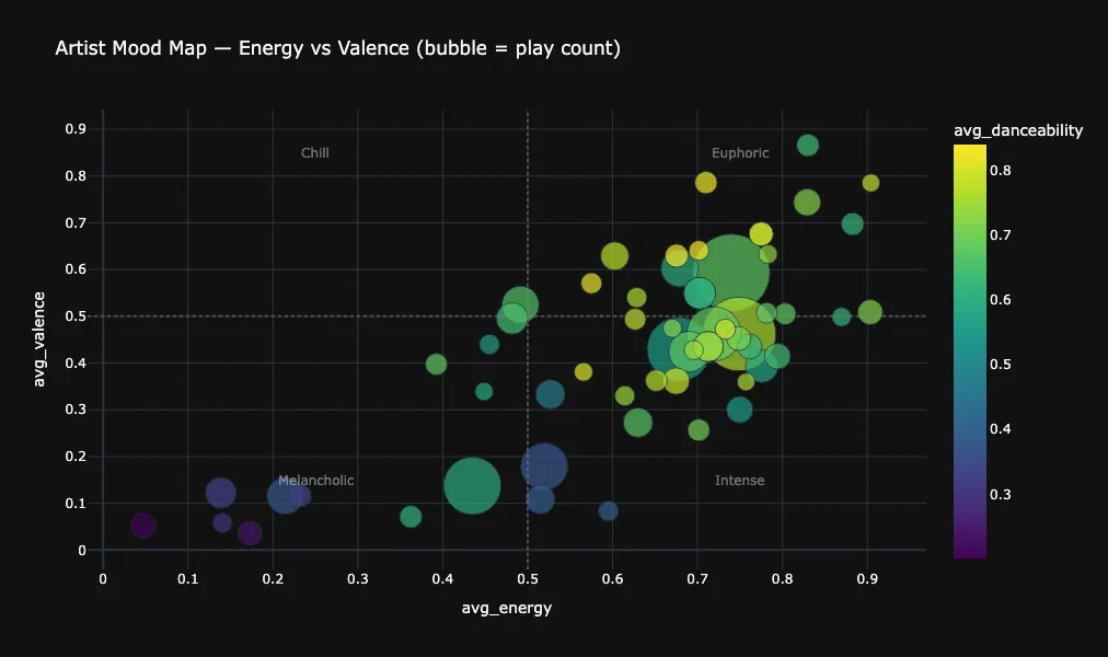
A scatter plot of the top 60 artists positioned by their average energy (X axis) and valence (Y axis), with bubble size proportional to play count. Bubble colour encodes danceability and dashed lines at 0.5 divide the space into four mood quadrants. This chart is interactive, but here we attached simply an export as an image so hovering over it doesn't work as it did in the notebook.
The distribution is not uniform across the four quadrants as there's a heavy concentration in the lower-left area (what we consider melancholic: low energy, low valence) where several large bubbles cluster; these are likely the film score composers (Hans Zimmer, Alexandre Desplat, Trent Reznor) whose music is characteristically atmospheric and minimalist. The upper right quadrant (euphoric: high energy, high valence) also has a healthy population, with several mid-sized bubbles and a few large ones; these are the hip-hop artists whose music tends to be energetic and upbeat.
The bottom-right quadrant (Intense: high energy, low valence) contains a few notable bubbles that lives very close to the euphoric zone, with very similar artists and genres. The upper-left quadrant (Chill: low energy, high valence) appears the least populated.
The danceability colour gradient (purple to yellow) adds a third dimension and shows that many of the hip-hop bubbles appear in lighter colours indicating higher danceability, while the film score and industrial rock bubbles tend toward darker colours. This makes intuitive sense: rap is fundamentally rhythmic and dance oriented, while scores and industrial music prioritize atmosphere over groove.
The largest bubbles (highest play count) span multiple quadrants rather than clustering in one, confirming that my most played artists are sonically diverse; I don't just listen to one mood.
Chart 7: Mood Quadrant Distribution
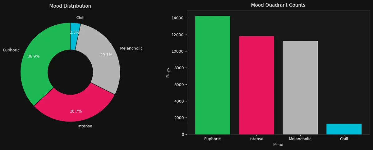
A donut chart and bar chart showing how my listening splits across the four mood quadrants, and the numbers tell a definitive story.
Euphoric leads at 36.9% with more than a third of all plays fall into the high-energy, high-valence corner. This is the upbeat, feel good, get pumped quadrant, and its dominance makes sense given the hip-hop heavy listening/playlists. Intense comes next with 30.7%, and combined with euphoric, that means nearly 68% of all listening is high-energy. Melancholic takes 29.1%: low energy and low valence, the introspective, focused, or ambient corner. This is where the film scores tracks live. Chill is a tiny sliver at just 3.3%, it is almost entirely absent from the data.
The bar chart on the right confirms this numerically with the plays count: euphoric leads with roughly 14000 plays, intense and Melancholic are close together at approximately 11000-12000 each, and Chill barely registers at around 1200 plays.
The near total absence of Chill music is the most striking finding: there's essentially no mellow, easygoing listening happening. The data polarizes into either energetic music (Euphoric + Intense = 67.6%) or subdued music (Melancholic = 29.1%), with almost nothing in the relaxed middle ground. This shows that I use music for either activation or introspection.
Chart 8: Mood Evolution Over Time
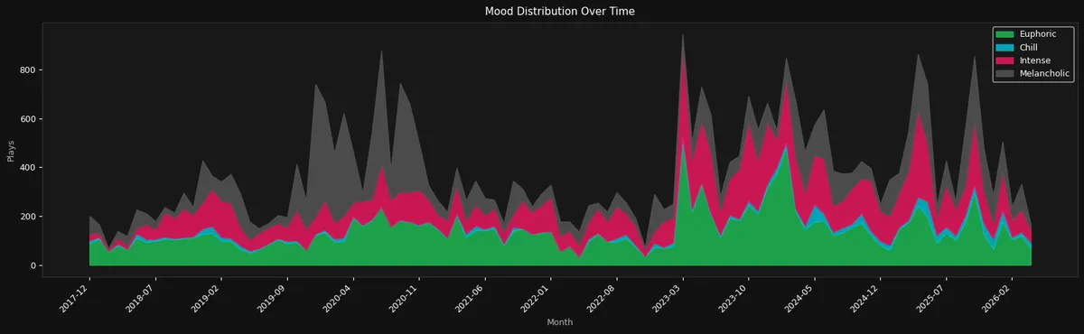
A stacked area chart tracking how the four mood quadrants accumulate each month over the full history. The four colours (green for euphoric, pink/red for entense, grey for melancholic, and cyan for chill) stacked on top of each other, so the total height represents overall listening volume while the proportional bands show mood mix.
The overall proportions stay remarkably stable over time. There is no dramatic seasonal swing as the euphoric green band consistently takes the largest share, followed by intense and melancholic in roughly equal proportions, and Chill as a barely visible. This stability suggests that the mood breakdown isn't driven by one anomalous period but reflects a long term preference.
One thing to note is the changes during COVID different lockdows, and the new trend starting in 2023. For the latter, it coincides with the period when I started working out regularly, and the lows during this second half overlap with the periods when I stopped hitting the gym and/or running.
The intense peaks could also be linked to the drop of a new rap album as I tend to play them in repeat to judge them. But these shifts should be are subtle.
Chart 9: Energy vs Valence 2D Kernel Density
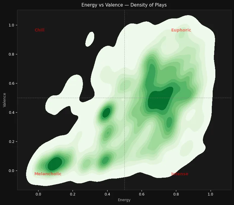
Unlike Chart 6 which plotted per artist averages, this 2D kernel density plot shows the full distribution of individual play events in the energy-valence space. The density contours reveal exactly where listening is concentrated, and the insights are the same as those in Chart 6.
Chart 10: Skip Rate vs Audio Features
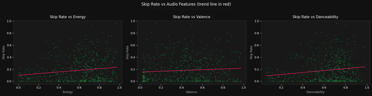
Looking at these scatter plots, the first thing that jumps out is that thick, solid line of green dots anchored right to the bottom of all three charts. It is a comforting visual confirmation that, for the most part, I actually do finish the songs I start! You can also clearly see my overall musical bias here, with the vast majority of the data points clumped heavily on the right sides of the energy and danceability scales, perfectly mirroring the high energy profile we saw earlier.
However, those rising red trend lines expose a really funny paradox in my listening behavior. Even though high energy, highly danceable tracks make up the absolute core of my listening history, they are actually the exact songs I skip the most often. It seems that when I am listening to slower, acoustic, or atmospheric music, I am happy to just let it wash over me. But when I put on a "heavy" track, my attention span plummets; I become brutally impatient, ruthlessly hitting "next" if the beat doesn't hit exactly the way I want it to.
Interestingly, the middle chart proves that the emotional tone of the music has practically nothing to do with my attention span. The trend line for valence is almost completely flat, meaning that whether a song is euphorically happy or devastatingly calm, my skip rate stays exactly the same. Ultimately, it is not the mood of the song that tests my patience, it is entirely about chasing the perfect groove.
Genres
Chart 11: Top 25 Genres by Play Count
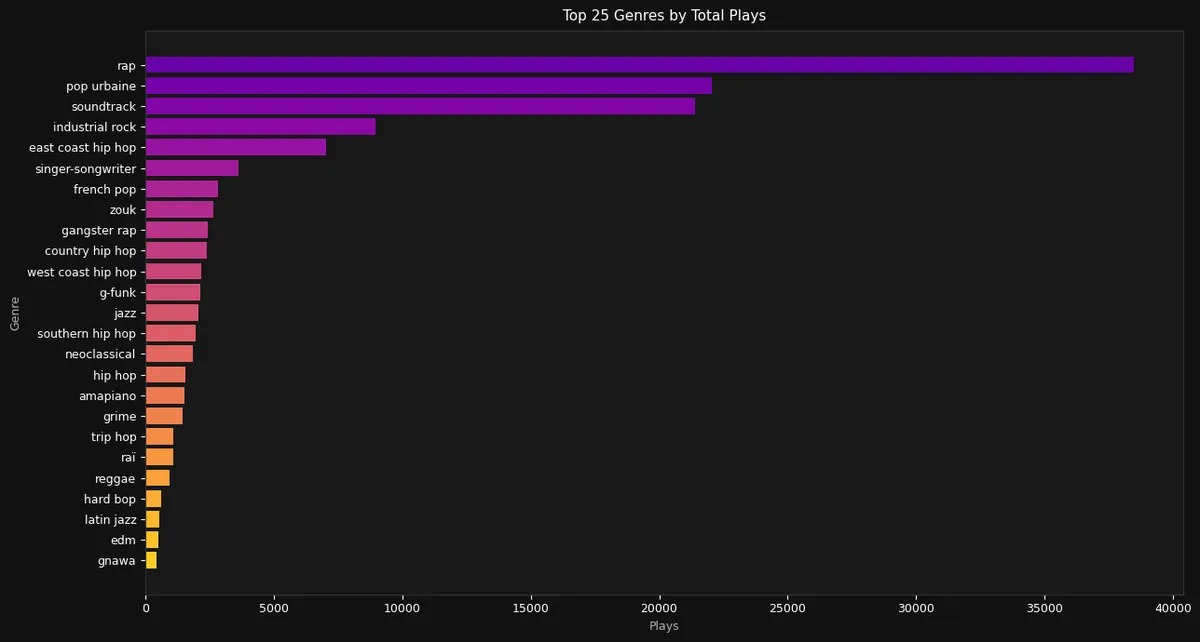
Staring at my top 25 genres, there is absolutely no denying the undisputed leader of my listening history. The catch-all "rap" category completely eclipses everything else on the board, pushing near a staggering 40000 plays. It makes total sense when I look back at the sheer volume of JAY-Z, Eminem, and Kanye West I have consumed over the years. However, seeing that top purple bar stretch almost twice as far as the runner up really puts my ultimate musical bias into a staggering visual perspective.
What really fascinates me, though, is the distinct cultural fingerprint scattered throughout the rest of the list. With "pop urbaine" sitting in second place, alongside appearances from "french pop," "zouk," "raï," and even "gnawa," my heavy rotation of Francophone and global artists is incredibly visible. It perfectly tracks with my intense, albeit impatient, listening sessions of French (speaking ;)) artists, proving that my daily soundtrack has a deep, undeniably localized flavor to it.
The chart also beautifully validates the dual nature of my listening habits. Right beneath the hip-hop and urban pop domination sits a massive block dedicated to "soundtrack" and "industrial rock," perfectly representing my deep dives into cinematic scores and Nine Inch Nails. Beyond those heavy hitters, the long, colorful tail of the chart shows an incredibly granular breakdown of my musical tangents, scattering my remaining plays across highly specific niches ranging from "g-funk" and "neoclassical" to "hard bop" and "amapiano".
Discovery and Listening Behaviour
Chart 12: Artist Discovery Timeline
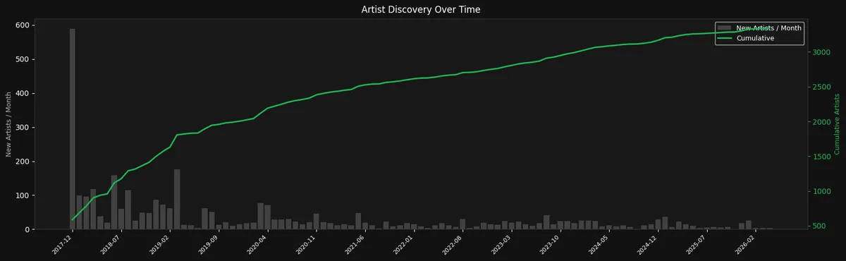
A dual-axis chart combining grey bars (new artists discovered per month, left axis) with a green cumulative line (total unique artists, right axis).
The story this chart tells has distinct chapters:
2017-2018 The Onboarding Explosion: The very first months show enormous bars with nearly 600 new artists in a single month early on, followed by several months of 100-200 new artists. The cumulative line shoots upward steeply. This is the initial migration effect: when you start using Spotify, your entire early listening counts as "discovered". The early bars are thus not genuine month by month discovery.
Mid-2018 to mid-2019 - Settling In: The bars shrink to 50-80 new artists per month, with a spike around early 2019 (~175 new artists) that might correspond to a new genre exploratory phase. The cumulative line continues climbing but at a shallower angle.
2020 onward; The Long Plateau: From roughly 2020 through 2026, new artist discovery drops to a steady trickle of 10-30 new artists per month. The cumulative line flattens into a gentle, near-linear slope. By this point the listening habits are "mature" as most listening is focused on known artists, and genuinely new discoveries are rare. The cumulative total reaches approximately 3400 unique artists by early 2026.
Occasional spikes in the later years: visible around late 2023 and late 2024, these suggest bursts of exploration, discovering a new genre or diving into a curated playlist (those periods overlap with my visiting and stays at family's). But these spikes never approach the onboarding era levels, topping out at maybe 30-40 new artists in a month.
The overall shape is classic adoption curve behaviour: rapid initial acquisition, a transition period, and then a long tail of incremental additions. The cumulative line's flattening implies that the data is approaching a kind of saturation point: the 3400th artist adds less marginal value than the 340th.
Chart 13: Track Completion Distribution
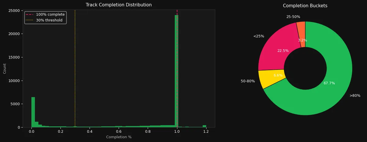
Two panels showing how fully I listen to tracks, and the distribution is strikingly bimodal.
Left panel (histogram of completion %): There are two massive spikes and almost nothing in between. The first spike is at 0%: a tall bar of roughly 5000-6000 plays where the track was abandoned almost immediately. The second and much larger spike is right at 100%: an enormous bar exceeding 23000 plays where the track was listened to all the way through. The middle ground (10-90% completion) is nearly empty, barely registering above zero. The 30% threshold, marked with a yellow dashed line, reflects what I initially believed to be Spotify’s official “counted stream” cutoff: that a play must reach 30% of a track’s duration to qualify for royalty purposes. However, after generating the graph, I learned that the actual rule is based on a 30 second minimum, not a 30% one.
Right panel (completion bucket donut): The numbers completes the ones in the right panel as 67.7% of all plays are >80% complete and the dominant behaviour is finishing tracks. 22.5% are <25% complete, the "quick skip" behaviour; whereas the middle buckets are tiny: 3.2% fall in 25-50% and 6.6% in 50-80%.
This is a highly decisive listening pattern as there's almost no "I'll listen to half and move on". Instead, it's a binary: either the track hooks me in the first few seconds and I commit to the end, or I reject it immediately and skip it. The 22.5% skip rate might seem high, but remember this includes shuffle plays, autoplay suggestions, and album tracks that don't match the current mood: all contexts where quick skipping is natural.
Release Eras and Metadata
Chart 14: Plays by Release Decade
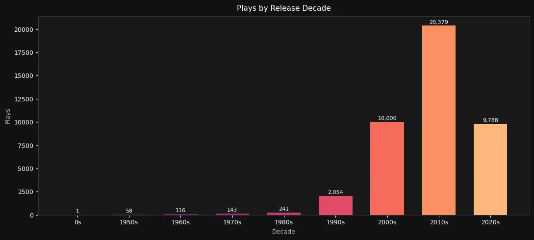
A bar chart displaying exact play counts annotated on top of each bar, with a color gradient ranging from dark tones (representing older releases) to lighter ones (representing more recent ones). Each bar corresponds to a specific decade of the music’s release, allowing for an easy comparison of listening trends across time while also visually emphasizing the chronological progression.
The 2010s dominate massively with 20379 plays, so nearly half of all plays come from music released in a single decade. This makes sense: the 2010s were both a prolific era for hip-hop and the decade when I was most actively discovering and building my music taste (i am still stuck in the 2010's, yikes!). The 2000s and 2020s are nearly tied at 10000 and 9788 plays respectively, forming a second tier. Together, these three decades (2000s-2020s) account for over 94% of all listening.
The 1990s contribute 2054 plays, a meaningful but still a much smaller slice. This decades saw the release of major classic albums by my top artists, so it makes sense. Everything before the 1990s is negligible: 1980s (241), 1970s (143), 1960s (116), 1950s (58), and a single play from the "0s" (pre-1950s). The data is overwhelmingly "modern", and even the jazz and neoclassical listening identified in previous charts must be largely from contemporary recordings rather than historic ones. There is a bit of bias here, as I listen to "remastered" album editions whenever available (especially for jazz), and the release year of these albums is not quiet the real actually.
The 2020s bar (9788) is notable because the 2020s decade is only partially complete (barely 6 years out of 10 at the time of analysis). If the current rate holds, 2020s releases would eventually surpass the 2000s and potentially rival the 2010s, suggesting my listening isn't just nostalgic for a fixed era but actively incorporates new music.
Chart 15: Tempo Distribution with BPM Genre Bands
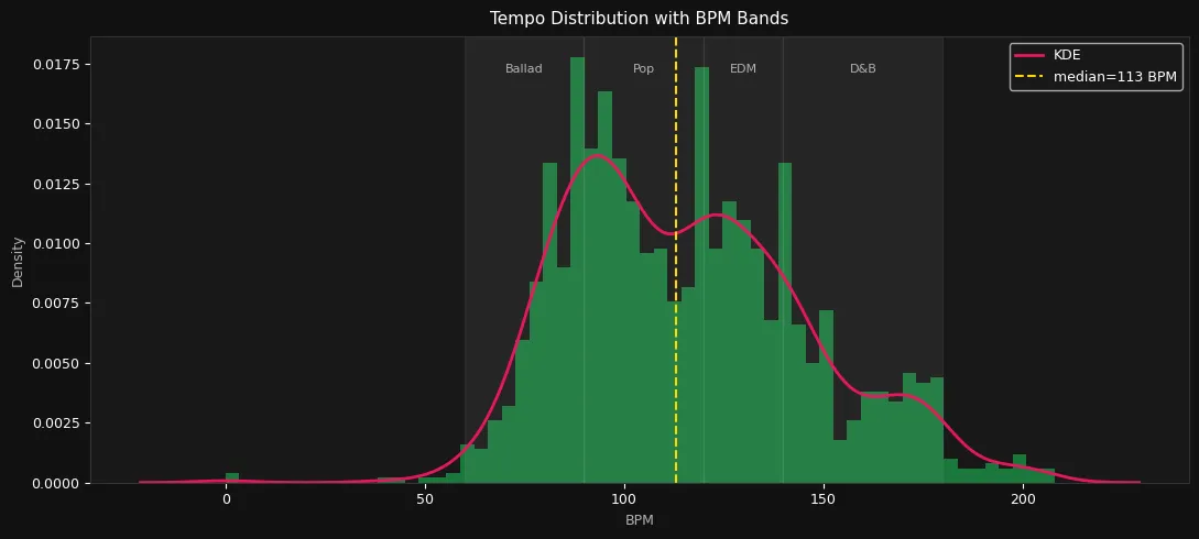
When I first looked at the tempo distribution of my entire Spotify history, the shape of the curve completely validated my highly polarized taste in music. Instead of a single, massive peak in the middle, that red density line forms two distinct mountains, proving that I essentially bounce back and forth between two entirely different sonic worlds. The highest peak hits right around 90 BPM on the border of the "Ballad" and "Pop" bands, which is the undeniable sweet spot for the heavy rotation of hip-hop and R&B artists we saw dominating my top genres.
However, that second massive spike hitting perfectly between 120 and 130 BPM tells a completely different story. Sitting squarely in the "EDM" band, it exposes my heavy reliance on energitic tracks for heavy gym sessions or intense runs. Even more fascinating is the fact that my overall median sits at exactly 113 BPM, right in the middle of a noticeable dip in the chart. It perfectly illustrates that I almost never settle for a "middle of the road" tempo: I either want to be firmly locked into a laid back beat or completely energized by track, skipping the middle ground entirely.
Chart 16: Explicit vs Clean Tracks
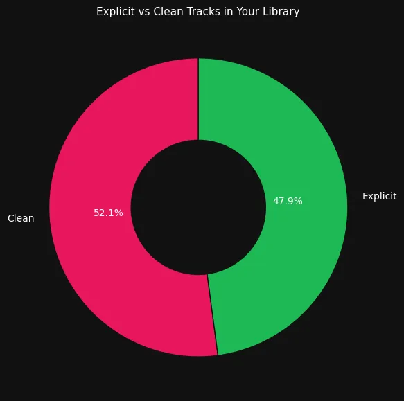
A donut chart showing 47.9% explicit and 52.1% clean listening history: an almost even split.
Given that the listening history is dominated by hip-hop (a genre known for explicit content), the near 50/50 balance might seem surprising. But it makes sense when you account for the other major genres: film scores, neoclassical, and jazz are entirely clean (instrumental music can't be explicit AFAIK), and artists like John Mayer and other pop stars lean clean. The film score and instrumental content essentially balances out the heavily explicit hip-hop catalogue.
Time-of-Day Mood and Long-Term Trends
Chart 17: Mood x Hour Heatmap
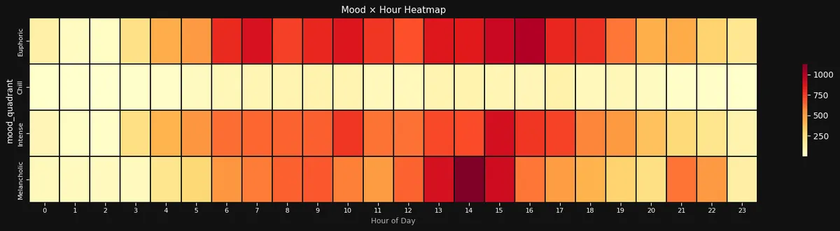
I like heatmaps, so I could not resist mapping my four musical moods across the 24 hours of the day. This yields a heat map that is as revealing as it is hilarious since the absolute most glaring detail is that the entire "Chill" row is a complete ghost town, rendered in a flat, pale yellow from midnight to midnight. Even though I previously assumed I spent a lot of time unwinding to laid back tracks, the data clearly disagrees, completely stripping "chill" from my daily routine. Instead, my daily soundtrack is a wild, bipolar swing between the absolute extremes of the emotional spectrum.
The "Euphoric" row completely dominates the board, proving that I heavily rely on upbeat, positive tracks to power my routine, starting with a bright red surge right out of the gate between 6:00 and 8:00 AM (that was my gym time for a while). However, the absolute crescendo of my daily listening habits sits squarely in the mid afternoon. Between 14:00 and 16:00, the euphoric, intense, and melancholic rows all simultaneously hit their darkest, deepest reds. That afternoon window is clearly my ultimate power hour and is the exact moment of the day when I am completely dialed in and blasting my music at maximum emotional capacity to finish out the workday.
Chart 18: Monthly Avg Energy & Valence Trend
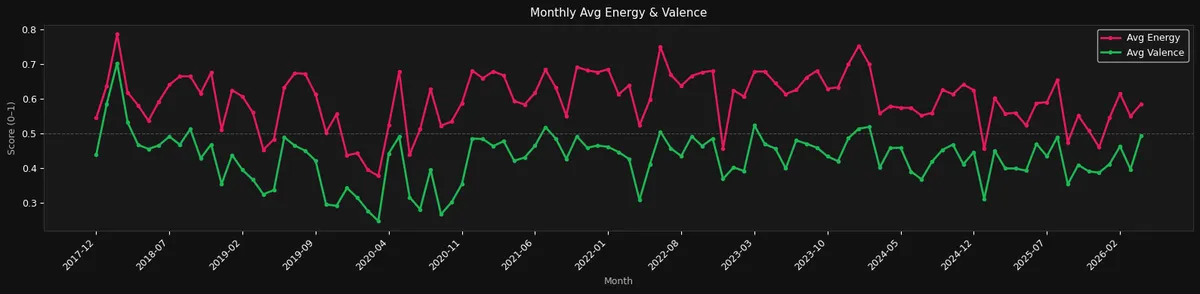
Looking at this long term timeline of my musical energy and valence, the persistent gap between the two lines is in sync with the evolution of the two measure. The bright red line shows that my average monthly energy almost never dips below the halfway mark, yet the green valence line sits firmly in the bottom half of the chart for nearly eight straight years. Beyond my general musical taste and its evolution, the absolute defining moment of this entire graph is that massive, plunging canyon right around the spring of 2020. It is fascinating to see real life events perfectly mirrored in my Spotify data. As the world went into lockdown, my daily soundtrack clearly took a massive turn, bottoming out into the absolute slowest, and lowest energy music I have ever listened to in my life. Thankfully, that deep slump didn't last forever and we bounced back through 2021, stretching all the way into the present day in early 2026 as my listening habits have settled into a remarkably stable, rhythmic pulse. The wild, dramatic swings of my earlier years have completely smoothed out, and it seems that I have clearly found my ultimate sonic comfort zone, leaving me permanently locked into a predictable groove of high-energy, slightly melancholic anthems.
Wrapping Up
These graphs started out simply as an answer to the first questions I asked myself when looking at the schema of my data in the data lakehouse. They were generated ad hoc in a Jupyter notebook just to scratch an analytical itch, but seeing the results has inspired me to take it further than planned. While these (mostly) static charts were great for a quick exploration, a more robust and industrialized solution is currently in the works: a fully interactive Power BI dashboard deployed in Microsoft Azure for a real time full picture (pun intended).
Looking back at the whole picture, my musical identity clearly relies on two massive pillars: hip-hop and film scores. Interestingly, they pull in completely opposite directions on nearly every single audio feature. On one side my hip-hop rotation is highly energetic, danceable, vocal heavy, explicit, and upbeat. On the other side, the cinematic scores I love are quiet, virtually undanceable, purely instrumental, clean, and deeply melancholic. Together, this constant tug-of-war perfectly explains the massive bimodal distributions we saw across different charts.
It is also incredibly obvious that my listening is, fundamentally, a workday habit. The time of day and day of week patterns are strikingly consistent with a standard 9-to-5 schedule, proving that music serves as a strict focus companion first and a casual leisure activity second. This makes perfect sense given my environment for the last few years: I work in an open space office where people are taking loud calls and meetings all day long, so putting my headphones on and blasting a familiar playlist is essentially the only way I can block out the chaos and actually concentrate.
Because of that intense need to focus, my library is highly decisive rather than just ambient noise. The completely barren "Chill" quadrant and that extreme, bimodal track completion distribution where I either skip a song in the first five seconds or ride it out to the very end, prove that I engage actively with what I am playing. I don't just put on generic background filler but demand the exact right beat to lock me into my workflow, and I never hesitate about skipping anything that breaks the spell.
Perhaps the most surprising takeaway is just how remarkably stable my taste has remained over time. Despite years of heavy exploration and thousands of unique artists passing through my ears, my average monthly energy and valence metrics have barely moved an inch. It shows that even when I am discovering new artists, I am not really expanding my horizons but simply finding new voices that perfectly slot right into my existing, rigidly defined sonic comfort zone.
Finally, that steep drop off at the end of the timeline makes a lot more sense to me now. As seen in the data for early 2026 so far, I am objectively listening to less and less music than I ever have before. Honestly, it is a bit weird to admit, but lately, I often find music to be almost annoying or overstimulating. More and more, I find myself actively craving the conversational pace of a good podcast, or simply opting for the rarest audio feature of all: pure, uninterrupted silence. Ultimately, this deep dive was a fascinating mirror held up to my daily life, proving that our Spotify data is so much more than a list of favorite songs; it is a timestamped psychological profile of our habits, our environments, and our evolving relationship with sound.